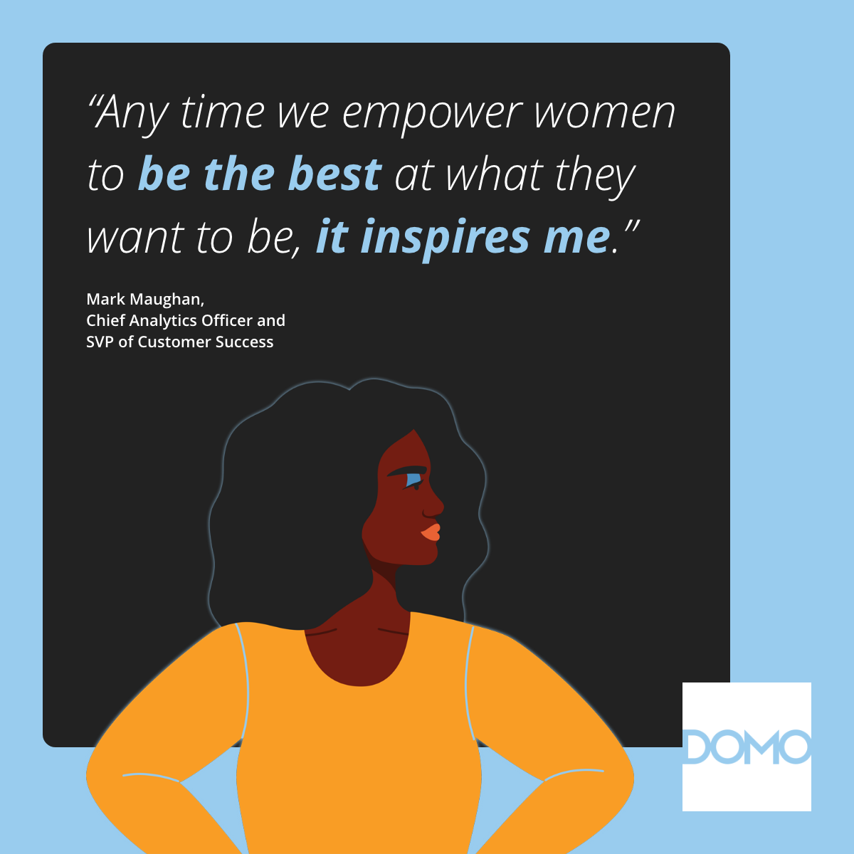
25 May 2011

Acai Action


So I've posted the postcards I created for Acai Action but never thought to post the actual packaging design until now. I did everything on this project from naming the product to creating the custom typeface used in the logotype. It was fun to work on a project where the only objectives were to make it fun and energetic.

06 August 2010

Bird Postcard

While trying to come up with ideas for some postcards, I thought it would be fun to make up headlines that used various animal names in the text. Each of them playfully lets the reader know that selling Acai Action can help them pay for college. Some graffiti animal stencil looking figures that I created in Illustrator and a spray-paint type font helped take this to the fun level I was striving for.

Bear Postcard

Lion Postcard

Pony Postcard

29 April 2010

Hainashorn

I thought it would be fun to combine a shark and a rhino (don't ask me why) and I'm very happy with the outcome. I looked up the German words for shark (hai) and rhino (nashorn) and combined them as well. Now to get shirts made with this cool imaginary logo!

19 October 2009

TrueTouch Nail Care Holiday Promo Card 2

Another fun option creating a fun shape with the nail color.

TrueTouch Nail Care Holiday Promo Card 1

In keeping with the style of other TrueTouch collateral, I created abstract shapes with the make-up photos. In this case, it was fun to turn abstract shapes into visual representations of snowflakes and trees. We sent this to our Japan office and they loved it. I considered that a real win.

04 September 2009

Neways U 2010 Identity

I created this mark without gradients. I used lines strategically spaced to create the illusion of gradients. This was a fun challenge. Whenever I felt the need to do a gradient, I thought, how can I do the same thing using only lines. I think it gives it a fun, almost retro look while maintaining a collegiate feel.

Diamond Retreat 2010 Identity

Diamond Retreat will be held in Park City, Utah. I wanted to capture the rustic feel of old Park City. The texture in the lettering is from the elevators in the proposed hotel. 3-D diamond created by Steve Keele with art direction from me.

TrueTouch Liquid Eyeliner Teaser Postcard

A postcard to tease the coming of a new "Intensifying Liquid Eyeliner".

01 June 2009

Ad For Next Year's Crystal Diamond Destination


I designed a series of ads to present various destination options for next year's reward trips. The layout was done by me as well as the copy for the headline. All other copy was written by Chris Yates.

Flipside of Ad

19 February 2009

Crown Diamond Logo 2009

This year, the distributors will go on a Mediterranean Cruise. This is the main logo. At every stop there will be a new supporting logo that will be printed on postcards, table tents, etc. as mementos of each stop.

17 November 2008

Identity for 2009 Crystal Reward Trip

Here is the identity for next year's Crystal Diamond Reward Trip. It is being held in Phuket, Thailand. I wanted to capture the flavor of Thailand. There are elements of the new Neways logo incorporated into the design along with seahorses, elephants, and diamonds.

12 September 2008

Book Cover Design

This story is about a young boy who grows up and goes to war. The story is centered around the tree house. I love the contrast between the figures' ages and the different colored backgrounds. In the end, the author decided to remove the figures and wanted the background all one color. It's unfortunate because it went from being very conceptual to being more realistic and not as exciting. The client is always right though and it still ended up being a nice cover.

03 June 2008

Book Cover Design

This wasn't too awfully creative as I just manipulated a photo of a woman to make her look more vampirish. I did however create the title which I think captures the feel of the book.

Poster Idea for Springville Playhouse

I designed this poster hoping the director and producer would use it. They both loved it but had already designed one prior to this and ended up using their design instead. Even though it wasn't used, I'm still proud of it.

25 April 2008

NewVera Brochure Front and Back Cover

NewVera Brochure Inside Spread

The pouring New Vera juice was pretty hard to capture in one shot so I ended up combining five of the best photos to get the perfect composite.

Ad Concept for National Publication

Final Crystal Diamond Reward Trip Identity - 3D Dice by Steve Keele


Illustration for Christmas Newsletter

Mock Poster for Yazoo Tour

Yazoo is one of my favorite bands and since they were touring for the first time in over 25 years, I thought it would be fun to do a mock poster. One of their biggest hits includes the line "Blue eyed dressed for every situation...". This was my inspiration for the eyes. The two figures represent Alison and Vince, the two members of the band.

Neways Healthy Homes Logo

This logo has been used on signage, newsletters, email blasts and distributor magazines.

07 September 2007

Package Design for New Vera

The old packaging for New Vera was in desperate need of updating. I wanted to portray Aloe leaves in the background. I even created the logotype to represent Aloe leaves as well. The distributors from Neways' biggest market, Japan, loved the new design. That was very satisfying to hear.